Mio
Product feature explainer animations
Project Description
To translate complex interoperability features into clear, elegant product experience stories that visually communicated Mio’s unique value while remaining platform agnostic and intuitive for users.
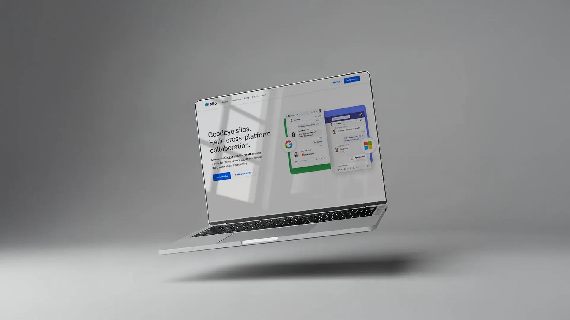
Mio enables seamless communication across enterprise messaging platforms, helping global organisations connect conversations across Google, Microsoft, Slack and Zoom. The project required motion content that could clearly express this interoperability without visually replicating any individual platform.
Visualising simplicity.
The first animation centred on Chat Sync, Mio’s flagship feature. I began by mapping the user journey to understand the essential interactions that needed to be communicated in under thirty seconds. This informed a design language that balanced recognisable cues with neutral visual metaphors, ensuring the story remained intuitive while avoiding direct platform imitation.
Working in iterative design sprints, I built a modular visual system that mirrored the fluid movement of messages across platforms. The motion principles drew on cognitive design techniques to ensure the user’s eye was guided through the narrative without friction, reinforcing Mio’s brand promise of seamless interoperability.
Communicating capability.
As the project expanded, I created additional product experience animations for Directory Sync and File Sync. Each sequence required its own functional narrative but had to live within the same overarching visual ecosystem. I approached this by developing micro stories that focused on the outcome for the user, grounding the motion in purpose rather than pure representation.
To meet the demands of different channels and contexts, every animation was delivered in multiple formats, from lightweight animated GIFs for social through to high fidelity 4K versions for conference screens and product demonstrations. This ensured consistency of brand experience across every touchpoint.
The suite of product experience animations brought clarity, simplicity and sophistication to Mio’s core capabilities, offering a unified visual language that could scale across marketing, sales and event environments. The high definition animated logo further strengthened the brand’s presence in presentations and speaker sessions. The project solved the challenge of visualising complex interoperability without platform mimicry, delivering a set of assets that elevated Mio’s story and enhanced audience understanding of the product’s value.
My role
 Design Director
Sector
Technology
Disciplines
Design
Skills
Motion Design